Rebuilding a Core CX Workspace for Scale & AI
Role
Solo Product Designer
Timeline
~3 months
Team
CEO & CTO, Engineering, ORM, Analytics Data
Platform
B2B SaaS CX platform
Context
As Locobuzz repositioned itself as an AI-first CX platform, its core workspace - used daily by agents and supervisors across 1,200+ enterprise brands - still looked and behaved like a legacy support tool. The brief was to modernize the product's surface and solve the structural friction underneath it, without breaking the muscle memory of teams who worked in it for hours every day.
The challenge
1. Perception problem - The product's visual language didn't reflect Locobuzz's AI-first positioning. It looked like a legacy support tool, not the intelligent CX platform the company was becoming.
2. Usability problem - Core workflows had accumulated friction that users learned to work around: search only matched exact keywords, ticket context was hidden, filters lacked hierarchy, and a customer's cross-channel history was fragmented across separate tickets.
Designing with the people closest to the work
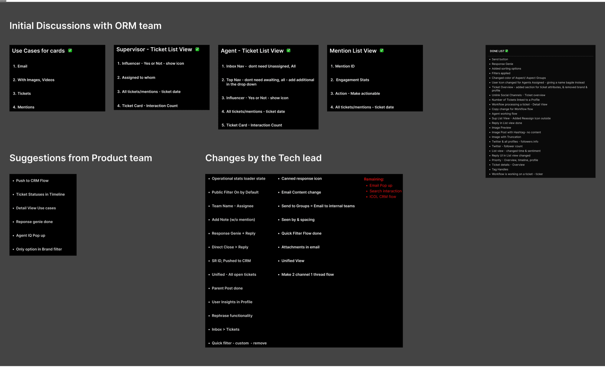
This was a solo design effort, not a solo decision-making process. The Online Reputation Management (ORM) team participated in ongoing working sessions; analytics data team data informed priority and filter order; and feasibility checks with the engineering team happened early enough to shape the solution.
From Friction to Flow
Key UX Solutions
Filters built around intent, not menu hunting
Problem: The filter drawer was a flat stack of accordions with no clear hierarchy, so agents relied on trial and error to build a useful view.
Solution: With 78 filter types across seven groups, the redesign addressed two structural issues:
- Lack of hierarchy - I partnered with the analytics data team to order filters by real usage, bringing the criteria agents relied on most to the surface instead of presenting every accordion as equally important.
- Recategorisation - Working with the ORM and product teams, I regrouped filters whose labels or placement made them difficult to find. An intent-based search sat above the familiar accordions, adding a faster route without removing an established workflow.
AI-assisted search users could inspect and correct
Problem: Exact-match search made anything beyond a known keyword difficult to find, especially across a high volume of channels and tickets.
Struggle: This feature involved a lot of back-and-forth with the engineering team because interpreting plain language and resolving it into an editable query required significant development work. We ultimately agreed that the experience was worth the additional build time.
Solution: A command-palette search accepts a plain-language request, then visibly resolves it into an editable structured query. That final step made the AI understandable and correctable - not a black-box guess - and helped align the concept with engineering.
Ticket context in seconds, not a full thread read
Problem: Ticket-related information was scattered across the detail page. The summary sat near the mention title, while a low-affordance control in the top-right opened a drawer with six horizontally scrolling tabs. Usage data showed that most users did not discover or use the horizontal scroll, making key context difficult to find.
Solution: I removed the horizontal tab pattern and consolidated ticket context into a single, clearer drawer with accordions. The Ticket Summary lives within the same drawer, but stays collapsed until a user requests it because generating the summary requires an AI call. When opened, it brings together a quick synopsis, emotional journey, detailed and timeline summaries, the issue, and customer expectations.
AI support kept agents in control
Problem: Agents had no in-flow support while replying, making tone, relevance, and response quality entirely manual and inconsistent across teams.
Solution: Response Genie drafts a Knowledge Base-grounded reply directly above the composer. Clear source labeling plus simple Use and Discard choices let the agent decide what gets sent, keeping the assistance fast but accountable.
Making a connected workspace
The redesign also gave agents tools to understand the broader customer story.
Unified View connects mentions across channels
Post Insights makes longer threads easier to understand.
Outcomes
• The full redesign shipped, bringing the core workspace in line with Locobuzz's AI-first product direction.
• ORM and client-facing teams responded strongly to the new workspace and its clearer everyday workflows.
• Formal post-launch usage analytics were not available before my departure, so the impact is represented through adoption and qualitative feedback rather than unmeasured metrics.
Key learning
The strongest decision wasn't a UI choice: it was using real filter-usage data to make a small but consequential interaction defensible. It reinforced how much better product decisions become when design brings frontline teams, analytics, and engineering into the same conversation.